MEMBER PROFILE FOR Nilfennasion
Average Overall Score Given: 7.00000 / 10
Total Forum Posts: 5
Reviews
Kung Fu Chaos
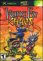
 Overall: Face Full Of Fists is the sub-title on the Australian version of the cover art, but Fist In The Face Of Political Correctness would be another good one. The allegations of racism are made utterly ridiculous as soon as the introduction begins to roll, using recreations of footage from real Kung-Fu films. The references to Enter The Dragon aren't just in the use of the theme music. Kudos to the developers for also putting in a big reference to Saiyûki, aka Monkey, one of the most revered Kung-Fu adventures of the 1970s. The reality regarding the accusations of racism is that the people who made the martial arts films this game is satirising put the stereotype out there in the first place, and knowingly exploited it in order to turn what was a small local business into what is now a thriving international industry. It is not a coincidence that the film studio that got the chance to make a film out of the Teenage Mutant Ninja Turtles was not a bloated Hollywood giant but a small Hong Kong studio that relied on creativity rather than money in order to deliver an entertaining product. THAT is what this game is a great celebration of.
Gameplay: People who have read many of my other reviews will have seen a pattern emerging. I complain often that the games try to compensate for having to little to keep the player's attention by being made so incredibly difficult that it becomes almost impossible for the average gamer to get anywhere. In another defiance of convention, Kung Fu Chaos keeps everything simple. Once you know which button to press to beat up your enemy, you can pretty much fight your way through any level, although you do have to master some of the more advanced tactics in order to excel and unlock the mystery levels of the game. Some of the levels don't even bother using most of the controller. One level simply involves catching a princess and then throwing her at other men on platforms. The whole thing uses one of the thumbsticks and one button, yet it is so delightfully wacky and surreal that one could play it again and again. Like the aforementioned Saiyûki, this game has many moments for "cheap stoners", the people who get the munchies just watching ludicrously bad special effects. Bravo to Just Add Monsters for making a video game where one doesn't have to spend months learning how to play it.
Graphics: KFC's visual aspect emphasises a cartoon feel. About the only thing that is realistic about it is the film scratches. This is in a direct contrast to other video games of the time, where we're drowned in statistics about how many polygons this or that skin texture has in it. Instead, KFC looks like a much more detailed version of the afternoon cartoon series Teenage Mutant Ninja Turtles. Obviously, the developers paid a lot of attention to the graphics and how the game should look, but they also realised that flash graphics mean nothing if your game isn't any fun to play. About the only complaint I do have is the movement of the camera, which sometimes makes things a little awkward. In some levels, you are meant to keep pace with the camera's movements, so one has to be wary of where they are on the screen. It makes balancing the racing ahead with beating up the bad guys a bit tricky. However, when the camera doesn't need to move, such as the aforementioned princess-tossing level, it stays as steady as a rock, like it should. In spite of not needing the equivalent of a rocket engine on the graphics card, so to speak, KFC is one of the single most pleasant games I've ever looked at.
Audio: Anyone who doubts the value of Dolby Digital 5.1 audio needs to play this game. As in HALO, the surround channels are used to draw the player into the game and keep them in the atmosphere. This is especially important since they are basically controlling an actor on a low-grade Kung Fu film. Obviously, there isn't nearly this much noise on any set, but we're viewing the film in terms of how it will look when it is cut together, so it stands to reason that the audio should match. Kudos to the developer for adding the custom soundtrack feature without even telling us. Although the main soundtrack is very good, and Carl Douglas' ?Kung-Fu Fighting? is wonderfully appropriate (as is the rest of the main music), the developers have to be applauded for giving the player a chance to break up the repetition by switching to their own mix. I personally recommend finding the most outlandish Japanese bands you can find, such as Final Exit, and occasionally put that on in place of the main soundtrack. You'd be amazed at how Japan, Hong Kong, and China can keep outdoing themselves in terms of music that leaves one scratching their heads.
Suggestions: I only have a couple of suggestions for the developers. First, the ability to have cooperative multiplayer is not to be overlooked. The replay value of this game is already high, but the ability of two or more players to fight side-by-side would have made it virtually unlimited. Secondly, if you are going to make a sequel (please do), hiring some authentic Kung Fu film actors to do voiceovers is a must. The voices of Masaaki Sakai and Shirô Kishibe are must-haves. Other than that, just keep on doing what it is you're doing, and for heaven's sakes, don't listen to the politically correct ninnies out there!
Overall Score: 10.0 / 10
 The Lord of the Rings: Fellowship of the Ring
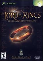
 Overall: Film to video game licenses seem to be a pretty dodgy proposition. They often have to be released within a certain amount of time relative to the film's release, so as to capitalise on the publicity. This means that making sure the game is ready, quality-wise, to face the world often gets put on hold. Which is a massive shame in this case, because the license has potential beyond count. However, it is not alone in squandering a great license, as its second sequel in particular manages to take a great concept for an adventure game and flushes it away. Perhaps the worst thing that can be said about this license of Fellowship can be "mediocre". It really could have used another six months of development, or better still, a different engine. The Legend Of Zelda might be a great game in and of itself, but that doesn't necessarily mean one should copy it, change the cosmetics of the characters, and try to pass it off as part of The Lord Of The Rings.
Gameplay: A lot of the time playing this game will be spent trying to find your way around locations. While the maps themselves are wide and detailed, exploring them is soon reduced to a chore because of several elements. First, when one encounters an element they cannot walk through, water being the most obvious example, the character goes through the motions of walking forward, but goes nowhere, as if he is trying to move through an invisible wall. A quick animation of him putting his toe in the water and then shying away would have suited the game much better, especially in light of the X-Box's capabilities. The second massive strike against the game is the movement and camera system. Not only is the vertical axis inverted in camera movement, but so too is the horizontal axis, making it highly counter-intuitive. One wastes valuable seconds trying to get a look at what they are fighting in crucial moments. What makes the camera situation even worse is how the movement stutters when you're trying to move over certain areas. If you climb hills, for example, and the path along the top is narrow, you can expect the camera to have some difficulty making up its mind which angle to show you. Normally, I would mention this in the graphics section, but during the combat sequences, this can be so detrimental to gameplay that it deserves to be considered a reason why I am only giving this a 2.5 for gameplay. Finally, and this is probably one of the more amusing faults with the gameplay, one can often walk past fearsome enemies without them bothering to chase you. I lost count of the number of times I evaded a Ringwraith merely by running at full speed. I can see an Elf or a Man doing this, but a Hobbit? Get serious, guys!
Graphics: Another problem with the game is that the colours of the graphics leave little room for making the picture intelligible. The only remedy the game even offers is a colour-bar calibration screen, but as someone who has calibrated his display in order to do literally hundreds of DVD-Video reviews, it isn't your display unit that is at fault - it is the textures of this video game! Next up is the appearance of the characters. Frodo, Sam, Merry, and Pippin are only distinguishable from one another by their clothes, and in the last two cases, even that isn't enough at times. Other Hobbit characters can be distinguished by their age or their hair colour, but the lack of detail really makes it difficult to see them as anything other than props. Gandalf's appearance is probably the best of the lot. He really looks the part of the tall, elderly Istari who bears the burden of much of the exposition. Another real problem is the Ringwraiths - the textures of their robes are utterly non-existent, making them almost invisible save for their armour in night scenes.
Audio: First of all, kudos to the developer for at least giving this game the Dolby 5.1 treatment. The placement of sound effects in the rears, even when those rear sounds tend to sound more like one channel than two, do wonders for the atmosphere. The sounds of combat are also a big help here, as are the sounds of animals either scurrying out of your way or trying to attack you. Unfortunately, the same cannot be said for the dialogue sequences. Tolkien is at best a difficult beast to translate into live action because of how much his characters say. Gandalf's description of what Gollum actually is stretches over most of a page, for example. The film performed a miracle by shortening it so that it didn't get in the way of the audience being able to pay attention while still keeping the gist true to Tolkien's word. The problem here is that the wordiness of Tolkien's text has mostly been retained, but a lot of things have been added that seem out of character, or worse yet, totally disruptive to the flow of the speech.
Suggestions: Stop doing film licenses. Obviously, these rarely translate into good video games. The time limit in getting this game onto the market obviously hurt it quite a lot, as there were some very obvious bugs or omissions that should have been sorted out long before the release date.
Overall Score: 6.0 / 10
 Halo: Combat Evolved
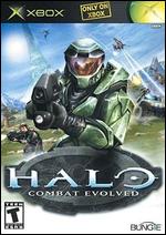
 Overall: The flagship title for the X-Box, HALO is truly one of those games that never gets boring. Frustrating at times because of the intensity of combat, yes, but never boring. Indeed, this is one of the few modern video games that successfully walks the line between challenging and making the player feel as if it is rigged, and does so well. If it ended just there, it would already be one of the best games ever, but it doesn't. Some of the most lifelike and awe-inspiring environments ever committed in pixel form make the game a joy to look at, the Dolby Digital 5.1 audio makes it a joy to listen to, and the gameplay itself tops the whole experience off nicely. If only all video games could be this good.
Gameplay: At its heart, HALO doesn't go far outside of the mould set by predecessors like Wolfenstein 3D, DOOM, or Quake. The game offers a first-person view through a super-soldier's eyes as the player shoots, bashes, or blows up any hostile creature. It's what they've added to the experience that makes the big difference. First and foremost, while the story is fairly linear, one can tell after playing through half of the levels that some actual thought went into making it in true cinematic fashion, rather than as a mere excuse to blow things up. Secondly, the combat is incredibly realistic. Enemies will come at you in swarms and exploit every possible advantage they can get. You really have to weigh up which weapon you want to use against a particular kind of enemy, and how you are going to use it. There are some enemies where a long struggle of trying to shoot them in the back or hit them with grenades might be traded in favour of hitting them with a rocket launcher. If you're lucky. The rocket launcher is also fun to use in anti-air or anti-tank roles. If it is a combat mode or move, you can do it in HALO. This, more than anything, is what makes it so superior to 3D shooters that have come before. In one of the game's more amazing plot twists, well, I won't spoil the nature of the enemy concerned, but I will say that they require a complete one-eighty degree turn in the tactics you use against them, which keeps the player nicely on their toes. About the only negative thing I can say about the gameplay is that it is too easy to get stuck against a wall, lose track of where you're going, and wonder why you're not moving when you want so badly to get away from an enemy. But this only serves to show what an incredibly adrenaline-inducing experience the overall game really is.
Graphics: Interlacing artefacts aside, HALO is one of the most pleasant games I have ever looked at, and with twenty years of gameplay under my belt, that's saying a lot. All through those years, I yearned and craved for a game that simulated a battle experience that could fool my mind into thinking it was vaguely realistic. HALO is the first game in all those twenty years that achieved this much. It is a pity that the X-Box does not support multiple resolutions for HDTV, as this game would look utterly incredible in 720P or 1080I on a widescreen projector or plasma display. All I have to say about the worlds rendered in the game is to keep an eye out for the first time you encounter a light bridge. Those who have played the game before know what I mean, but believe me, it will take your breath away, and then some.
Audio: This would be the only video game that does not support the custom soundtrack option, but still gets a 5 out of 5 from me. The reason for this is simple enough - the audio environment is so utterly immersive that it will leave the player trying to match audio cues with the precise location of whatever enemy they are trying to track. Anyone who doubts the value of multichannel audio has quite obviously never played this game, in other words. Indeed, this is why an X-Box without the Advanced AV adapator should be considered a waste of cash.
I'd also like to take the time to compliment whomever voiced the Guilty Spark. This is one character who sounds so smug and annoying that you want to kill him, but it is kept in enough moderation that it doesn't get in the way of enjoying the game. Well done.
Suggestions: My only suggestion would be to make more levels, multiple campaigns, or a random-level function. I would also recommend at least allowing the option of a custom soundtrack, as a bit of variation never hurt, but aside from those things, this game was enough to restore my faith in the industry. Well done.
Overall Score: 10.0 / 10
 Tony Hawk Pro Skater 3
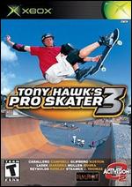
 Overall: People who read my comments might see a bit of a trend in them, namely that there are few games I've played that I haven't taken a severe disliking to. Tony Hawk 3 doesn't break the trend, although it does vary on the pattern a little. It started out being a little fun, I will give it that. Exploring the levels and getting a feel for the layout is a fun endeavour, but it starts to come undone once you try to make some kind of progress in the game.
One of the problems lies in the tricks. Sure, it's all well and good to try spinning through the air at a million miles an hour, but the impression soon sets in that the impossibility of landing without falling rises in direct proportion to how high a points total you have accumulated. On the second level, you find yourself listening to constant taunts from people on the sidelines, and that is where the game undoes itself. Instead of showing the player a good time as games are supposed to do, the game instead tries to make you feel as bad as it possibly can about being "unco". When your player suffers intermittent twitchings as a side effect of too many prescription drugs for bipolar disorder, this is a very bad road to go down. I have to wonder what is coming next from the Tony Hawk camp. Perhaps Tony Hawk insult machine is on its way?
Gameplay: In the defense of this game, the actual motion and steering feel quite natural. The makers of turkeys like Midtown Madness 3 or Project Gotham Racing would do well to sit and observe the smooth, free feel that Tony Hawk 3 gives the player. Instead of frustration, the basic mechanisms of motion in this game are transparent and utterly in the background. Rather than agonising over how you're going to turn into that corner or grind that rail, once you know the basics, you just do it. That's something all programmers could learn from, really.
Sadly, where it all comes crashing down is in the level designs. I don't know how manic Tony was when he suggested these layouts, but something tells me that with his Herculean delusions of what the professional skater is able to do, he needs his medication changed, post-haste. Many of the tricks and combinations necessary for simple forward progress in the game are enough to hurt the hands of even the most flexible gamer. I suspect that only the pro skater is going to be able to figure out exactly how to pull off some of the feats demanded of the player, and they have better things to do, anyway.
To summarise, the game has an excellent basic engine that allows total freedom of movement rather than annoyance. When a linear goal structure is imposed, however, it stops being fun in a big hurry. Tony Hawk would do well to dig up an old Commodore 64 and play an old skating game called 720. It was as unrealistic as hell, but the key difference was that it was just as much fun six hours after one started playing as it was five minutes after commencement of play.
Graphics: As a game, Tony Hawk 3 makes an excellent skating video. All the visual elements are nice and lovely, with only the occasional interlacing artefact to dampen the visual experience. The first level, a foundry, is an excellent example of just how far things have come since I was introduced to my first video game based around skateboarding. Molten metal is convincingly, not necessarily realistically, rendered. Snow is also well done in the next level. About the only environmental element that doesn't feel right is the water, but that's one thing that will probably never be realistically done in a video game.
The options to customise the skater are especially welcome. Being able to have a skater who stands about 5'8" tall and weighs 210 pounds is one of the highlights of the game. All in all, aside from there being too many signs of interlacing for my liking, I just cannot fault this game for the visuals.
Audio: I mentioned earlier that one level contains way too many people whose sole point is to remind you as annoyingly as possible how bad you are at the game. As if we really needed that. Aside from this one annoyance, however, the audio has no serious problems. You get the occasional environmental sound effect, a lot of grinding noises, and the odd non-irritating voiceover. That's all well and good. To be honest, this is not the sort of game where audio is going to be a major highlight.
A big thumbs up goes to the programmers for including the custom soundtrack option. While the provided soundtrack is a long way from being comprised of radio drivel, it is too far over the place to really find an audience. At least when one programs their own music into the game, it has some consistency. This is also the best implementation of the custom soundtrack option that I have seen to date. The randomising function makes the music truly random. The only complaint I have is that the time one spends in the levels means that unless the music you program in comes in at under two minutes, you're going to have to be prepared for the music to be cut off just as you're getting into it.
Suggestions: It's hard to think of suggestions when a game is actually fun but annoying at the same time. First, I would scrap the level designers and go with the philosophy of Doom or Quake, putting together the levels in such a manner so that every part is accessible through normal motions. Secondly, I would suggest recognising that not all players are so glued to their X-Box that they can just master every game instantly. Some of us have better things to do than prove we can instantly pull great moves out of our butts. Finally, different styles of gaming would be appreciated. In Skate Or Die, you still had to put together combinations of moves or tricks, but you could also race or joust, just to name two fun variations. Include something like that, and maybe this game will gain some replay value.
Overall Score: 8.0 / 10
 Project Gotham Racing
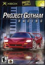
 Overall: Sometimes, you just cannot trust your gut instinct. Unfortunately, with all the abysmal games out there at the moment, finding a genuinely enjoyable game for the X-Box is getting more and more difficult. PGR is a good example of why. It quickly gets stuck in the middle of no man's land, being too difficult to appeal on the basis of arcade-style enjoyment, but not being difficult enough to be a simulation. Is it any wonder that the video games industry is in such a quandry?
Gameplay: Douglas Adams once wrote of a sleek, beautiful looking spaceship that seemed to just swallow light. One of the characters stated that it moved like a fish, but steered like a cow. That's how the steering feels in PGR. When you're moving along a straight road, everything is fine, but as soon as you go into a turn, you can count on losing the race to any AI opponent, which is the downfall of every racing game from Pole Position to Gran Tourismo - if you don't make the player feel like they are in control of the game and that their idea of a good performance will be rewarded, they will stop playing. It's really as simple as that.
Graphics: Visually speaking, I cannot fault the game. Everything looks nice and realistic, although some of the backgrounds are a little too static. Still, this gives rise to the belief that the developers spent too much time on the look of the game and not enough on the feel.
Audio: Kudos (no pun intended) to the developer for including the custom soundtrack idea. Now could we just make it a little easier to use? Furthermore, could we make it a little easier to balance the music in relation to the sound effects? Unless you use the ready-made soundtrack, chances are that you won't hear the custom soundtrack that you took so much time to put together.
Suggestions: Look up the word fun in the dictionary. The people do not exist to buy your video game - your video game exists to entertain them. Keep that in mind for the next sequel that I probably won't buy anyway.
Overall Score: 6.0 / 10
 Crazy Taxi 3: High Roller
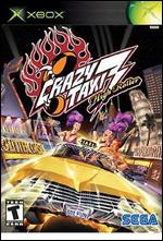
 Overall: The one video game that got me away from the PC and into consoles was the original Crazy Taxi for the Sega Dreamcast. Sadly, Sega's marketing department just doesn't seem to be earning its bread, and not only did they have major problems getting the Dreamcast into people's homes, finding their games on retailers shelves is often a tough ask. In spite of this, the third Crazy Taxi is a real treat to play. Not so much a sequel in the true sense, it is more of a compilation of ideas from the previous two games, with a few new ones thrown in for good measure. Having a choice of three different environments is nice, and the minigames are mostly brilliant. Overall, Sega make this gamer wonder why they just can't get a break.
Gameplay: Some say that the graphics on Crazy Taxi 3 are crude and the sound is limited. But these things are not nearly as important as a free, smooth gameplay that allows the player to enjoy themselves. In contrast to many other games out there that have lifelike graphics and stunning audio, Crazy Taxi 3 has gameplay that, while taking a little time to get in the groove of, garantees a lot of fun. The actual task of the game is incredibly simple - stop, pick up a passenger, take them to their destination, drop them off, repeat. It's the getting from the pick-up point to the drop-off point in the shortest possible space of time that presents the real challenge. While most of the routes are fairly straightforward, there are a few out-of-the-way destinations that must be handled carefully in order to ensure speedy arrival... or even arrival at all. Sometimes the adrenaline rush can make frustration of things not going well feel even more acute, so breaks are recommended every now and again. Overall, this is one game that should be used in every demonstration.
Graphics: Okay, the graphics are nothing terribly flash. Enough that the game elements make sense and you cannot miss things due to being underrepresented, but they don't have the same pizzazz as more recent games. This is actually a good thing, however. Rather than trying to tool up Crazy Taxi 3 to make it more "now", they have instead opted to keep the basic look the same and focus more on the gameplay. This does, however, result in some minor flaws. For example, the trees in park areas of the Small Apple look more like something you'd see on the old Commodore Amiga than a video games machine which about 100 times the processing power. Another complaint that is not so small is that the game engine often has trouble keeping track of where it, and the car, is going. The directional arrow that is meant to tell the driver where to go often spins around with no logical idea of where the destination really is, and on the (admittedly rare) occasions where the car gets stuck on something (jumping on top of another car for instance), the shaking of the camera and seemingly the car quickly brings headaches on.
Audio: Not good, not bad. Just there, really. The standard car engine noises are not nearly loud enough, and the voiceovers, when they do show up, are irritating. The music is okay at first - the standard Offspring soundtrack that was a gem of the first Crazy Taxi game is present and accounted for. It manages to create the right mood in spite of how tryhard I consider the band. However, this is why custom soundtracks are one of the most touted features of the X-Box. I would far prefer to be playing this game with Ministry's Jesus Built My Hotrod, or pretty much anything by Motörhead, playing on my Dolby 5.1 system.
Suggestions: Only two comments aside from the congratulations on a job well done. First of all, if you're unable to render large marshes trees in any better a fashion than an Amiga 500, then don't put them in the game. Second, there is a reason why there is a custom soundtrack feature on the X-Box. Please use it.
Overall Score: 9.0 / 10
 The Lord of the Rings: The Return of the King
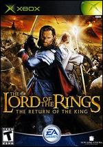
 Overall: When a game is being sold at some outlets for $110, the counsel of wisdom would be to rent it first and see whether it is worth what amounts to almost a day's income in this country. I'm glad I did exactly that, because I would be feeling pretty ripped off if I had just bought the thing sight-unseen. This is a perfect example of how to take a brilliant license and screw it up so badly that it defies comprehension.
Gameplay: The choice of three linear paths would have been nice if the other two options included more than three or four levels. It would have also been nice to have a co-operative mode that included more than just the one path. The problem is that the Hobbit's path in particular is annoying beyond all comprehension. It is literally impossible to kill the boss at the end of the Osgilliath level, so one has to run past him and hope that they can open the gate before he kills you. Which would be all well and good if the stealth ability lasted longer than half a second. Then there's the mission to protect Merry and ?owyn. Nice idea, but it is let down by the fact that it is fundamentally impossible without a lot of cheating. You're fighting Easterlings, Orcs, and trying to down Mumakil, yet you somehow have to find time to beat off the Ringwraith on his Fell Beast? The words "I don't think so" come to mind. The fact that the combat is too fast for the player to make real decisions and think about their consequences also strikes pretty hard against the gameplay. The Lord Of The Rings deserves better than what turns into a stock-standard button-masher in a big hurry.
Graphics: Visually speaking, the game is gorgeous. It's pretty hard to screw up anything relating to The Lord Of The Rings in this area, especially when you've got one of the most expensive films in history to draw from. The essential problem here is that the game moves too fast and chaotically for the player to appreciate this. Interrupting the combat with video sequences detailed to highlight some kind of objective does not help, either. Nor does the unhelpful camera angle - we need to be able to see what is on the road ahead, not be distracted by the back of the character we're playing. Find an angle that works for the level, and stick to it, guys.
Audio: There are some aspects where drawing from a film is not such a good idea. ROTK as a film has some of the most wretched dialogue that writers could ever hope to supplant their source material with. It would have been a far better, and more courageous, idea to have the actors voicing lines that are actually in the novel. The Gimli and Legolas double comedic act got tiring last year. Now, it is just annoying beyond belief. The absence of the ability to have a custom soundtrack only makes issues worse.
Suggestions: One, don't expect a big license to carry you. Two, playtest the game with individuals who know something about photography - that camera makes the game annoying beyond comprehension. Three, if you can't lengthen the game without making it too difficult to enjoy, don't even think about lengthening it. Four, the audio capabilities of the X-Box deserve better exploitation than this.
Overall Score: 4.0 / 10
 Buffy the Vampire Slayer
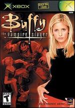
 Overall: Overall, not such a bad license, and at least they don't make a total hash of it. In fact, as a total non-fan of Buffy (I hold its star in a fair bit of contempt), I have to say this game had a lot stacked against it for me, and that it managed to get past that is a testament to the quality. There are some big annoyances, sure, but they are ones shared by every console game, so I can let them slide for the most part. It is nice to see a game revolving around fights that actually features realistic behaviour from the combatants. Every unfair advantage or cheap shot is exploited to the fullest by the enemy, making it a real joy to try and anticipate what the titular character's assailants will pull next. When the game goes into combat, it is all brilliant.
Gameplay: Unfortunately, the same cannot be said of the exploration and level navigation component. Truth be told, this is by far the most annoying part of the game. To borrow what seems like a Buffy-ism after playing the game for twenty hours, platform jumping is like so early 1980s. Jumpman made it into an art form, while later games like Ultima VIII used it solely to extend the length of the game, and it suffered badly for that. Combining platform-jumping with the inability to save your progress whenever you feel the need is a massive strike against the game, because as I have indicated in other reviews, nothing kills the fun factor of a video game nearly as quickly as having to do the same thing over and over again. This is the one great pity of the game, because if these platform sequences had been left out, the game would have been an absolute joy to play. Another, slightly less annoying, problem is the way Buffy aims... with the squirt gun or the crossbow, well, let's just say that it is a !&%$@#* ed good thing she is much better at melee combat.
Graphics: Visually speaking, Buffy is a real treat to look at. No, not the character, the game. Not since the Cinemaware games of the 1980s has there been such rendering of details in characters, either in cutscenes or in the general game. Sometimes the cheekbones or arms look a bit jagged, but that is the fault of "modern" television, not the game. The enemies one fights are realistically rendered and three-dimensional, which counts for a lot. About the only area where I can fault the visual aspect of the game is the camera's inability to let the player see what they are doing at critical times. Against one boss character, one has to more or less guess where the wall switches that open the windows to sunlight are, and the penalties for guessing wrongly for too long are quite steep.
Audio: The audio component is one of the game's fundamental weak spots, but this is true of many games, so it is important to go into why. The music gives a suitable atmosphere, and the effects for weapons or attacks do their job, but the dialogue is rather... abysmal. One really has to wonder whether the producers only budgeted in a single day at the recording studio for voiceovers, because the lines spoken by enemies in combat, while charming the first time, get old so quickly due to repetition that four levels is enough to make one glad for the silence of demons or demonic spiders. Buffy's lines are not a lot better. Sure, they're in character, or at least I understand them to be, but they get on the nerves like dust on the inside of a PC. Still, some marks go to the developers for the musical component.
Suggestions: There is a reason why the custom soundtrack option was included with the X-Box. There is also a good reason why nobody can remember platform-jumping games other than Jumpman or Super Mario Brothers. Lastly, the reason why games on the PC allow you to save whenever you feel like it is pretty critical.
Overall Score: 8.0 / 10
 Midtown Madness 3
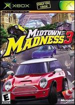
 Overall: They give this game away for free with the Beast Pack because it sucks dead bunnies through a straw. It sucks so hard, in fact, that I felt compelled to register as a member and say so in order to counter all the (obviously paid-for) positive reviews.
Gameplay: Sure, the graphics look really pretty, and the sound isn't half bad, but the one area where games developers are falling down all the time is that they fail to realise these things alone cannot save a video game. Part of the problem is that the developers seem to think that they have to extend the playing time of the game by making some of the levels virtually impossible. This prohibits any real forward progress in the game, and in turn limits the replay value, even in the multiplayer option, so severely that it just isn't worth the effort. Games like this are the reason why sites that post cheat codes are so !&%$@#* ed popular. Doing the same thing over and over and over is not fun, guys. Nor is having to do it because of making the slightest mistake. When I play a video game, I don't want to have to memorise the entire layout of the racetrack. The two-player mode is somewhat more fun, or at least it is after the cheat code is put in and one can choose which car they wish to use, but that only emphasises how much the single-player mode sucks.
Graphics: Well, it looks very nice. The cars are well-rendered, if a little jagged around the edges (but that is the fault of the idiots who came up with interlacing way back in the 1950s so I will let that slide). Unfortunately, two cities are not enough to save the game from becoming dull, especially not when the city map can be crossed on all sides in a matter of minutes. The "madness" part of the title is false advertising. Where is the fun in having pedestrians always magically dodging out of your way? Sure, Carmageddon's style of disintegrating them into ludicrous blood splatters is a bit much, but having them fly a few feet through the air is not too much to ask for. What MM3 comes off as is a version of Carmageddon (when is this coming out on X-Box?) approved by the sanitise-everything, treat-none-like-an-adult crowd.
Audio: The voiceovers are arrogant - I want to punch the voice actors just on principle. Kudos for trying to implement the custom soundtrack feature (which should be compulsory on all games), but could I please hear a different song every once in a while?
Suggestions: Get out of the market and take this rigged game with you.
Overall Score: 2.0 / 10
 Brute Force
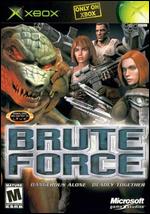
 Overall: I've read a lot of reviews expresing disappointment in this game. I have to admit, the developer brought this on themselves by inviting comparisons to what is literally the best FPS game since the great Wolfenstein or Operation Wolf (yep, my video gaming days stretch back that far). However, Brute Force is not necessarily as bad as some of the extreme detractors are making out. The problem, essentially, is that it is not that good, either. I have spent quite a number of hours getting through the game, and I have to say that the overall experience was quite underwhelming in the end.
Gameplay: In the early stages, the game is actually a lot of fun. While it is quite repetitive, walking around a map and shooting the stuffings out of virtual characters is a great way to relax. Where it all starts to go wrong is when the squad-based gameplay kicks in. A prime example of this is the fourth mission. You're expected to protect a spy, so what is the first thing he does after you rescue him? You guessed it - he runs out into the middle of an enemy-occupied area and just sits there while they take pot shots at him. Once you get past this demonstration of turning stupidity into an art form, the fun factor picks up again for most of the following missions, but the fact is that the developers obviously spent more time on the enemy's AI than they did on that of the squad. All too often, your squadmates will just sit there, not moving an inch, whilst the enemy rains rockets, sniper bullets, and whatever else is on hand upon them. This really becomes frustrating towards the final missions, where the ability to move around, and quickly, is quite critical. Given the heavy specialisation of the troops, it can also be annoying to learn towards the end of a mission that you really needed to keep a particular soldier alive in order to complete your task. It was, however, good to have a sniping mode that actually works in the context of the game.
Graphics: Visually, I found the game quite pleasing most of the time. On a display of eighty centimeters or more, the exquisite detail is really apparent. But what is also apparent is an over-reliance on fog and environmental effects. It would also have been nice to be able to clearly see the enemy. Which is where the sniping feature comes in - oftentimes, it is far more effective to look through the sniper scope to see where enemies are than to perform any normal kind of visual inspection. The cutscenes are also quite nice, although sometimes it is easy to get the feeling that the developers put more effort into them than they did the levels. Everything in the game is very linear in movement, with impassable walls on either side oftentimes, and it becomes clear soon enough that the developers couldn't be bothered making an actual interactive level environment. Which reduces the whole thing to accomplishing objectives in order to see the next lovely cut-scene.
I saved the worst for last. The camera position - incredibly bad. The characters get in the way of your view so often it makes aiming a real challenge (not in a good sense), not to mention that the camera zooms right into the back of the character's head whenever their back is to the wall, which makes any rational decision about how to move them impossible.
Audio: They really ran out of steam by the time they got to this part of the game. It is as if the developers only had time to create weapon sounds and voiceovers. The voiceovers were not very well realised, either. There is roughly four and a half gigabytes of space on a DVD, so surely they had enough room to put a wider variety of lines in there. After hearing Brutus growl that this pack is no match for ours for the thousandth time, it gets so old that one would turn the sound off if they didn't need it to determine exactly when the enemy is firing. A custom soundtrack feature would have been nice, too, given that there is absolutely no music (or at least none that I remember) in the game, and trying to find one's way around is incredibly tiring without some kind of distraction.
Suggestions: First, ditch the third-person perspective. Shiny Entertainment could make it work in MDK, but you obviously cannot. Second, do more work on the sound - the audio component of this game is incredibly lazy to say the least. Third, if making the game so difficult that the player winds up doing the same thing twenty times over and screaming at his display as a result is the only way to make the game longer, then just go with a shorter game. Games are supposed to be fun, and nothing kills fun faster than repetition.
Overall Score: 7.0 / 10

