MEMBER PROFILE FOR Woocifer
Average Overall Score Given: 5.33333 / 10
Total Forum Posts: 389
Reviews
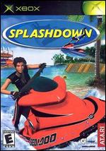
Splashdown

 Overall: The thing that attracts me so much about this game is that it's flat out racing with the fun of racing on a completely dynamic track. The water movement, balance of the watercraft and judgement of the surface of the waves makes this racing game a little different than most out there.
The visuals are pretty !&%$@#* impressive. The models are a little to be desired and the splash effects are not the most impressive(but are effective in their physical nature), but the water is absolutely AMAZING. I have never seen water done this way in a game before. I thought it looked great on the PS2. The few levels that were made for the Xbox exclusively look rediculously realistic.
The tracks, though somewhat similar, do vary in their methods of racing, locales, shortcuts, and effects.
All in all this game is enjoyable and very approachable. It is nice to have a game about recreational activity and done with such fluidity.
Gameplay: Though I figured out the controls very quickly and quite easily, I have experienced that some do need some time to figure out the physics. The physics are a bit forgiving in this game and are pretty loose, but it actually doesn't make the game aggrivating. Slamming into the water, submarining, jumping and doing tricks are VERY simple tasks, and always should be in the case of a game.There is just something enjoyable about speeding along water that looks like REAL water! The mechanics can be a little cheesey and the AI can screw you over, like placing you infront of a jump just after you bailed only to find that you can't get over the jump without more distance and velocity. All in all though very enjoyable.
Graphics: I can understand that the models, watercraft, splashes and environments would seem to be a bit of a let down but that is only because of the amazing job they did with the water and the lighting. Seeing a setting sun and the sky reflected by a realistically transluscent liquid(water, duh) is almost photorealistic. Its not like that in every level, but for the most part, THIS is the benchmark that they should use for all water. It reacts to your craft, to surrounding changes in the environment(not weather) by creeping and breaking apart up the banks of the riverside, and it even reacts to you flying through the air and sinking into it. You have to see it to understand how nice a job they did with H2O. Not the best models, but the water is great!
Audio: The sounds in the game are pretty mediocre. It has the generic boring new punk soundtrack including all your sounding the same bands like Blink 182, Sum 41, SRD71, Sum 182, SRD41, Blink 71, Blum 1871 41, 41 Sum Blink, SRD Sum Blink 182 41 71.....you get the picture. They let you put your own soundtrack on, but you can't save that as a setting which is annoying. Other than that there are a few voice overs, that are lost in the noise of the race, of the riders when they go ahead or fall beind. They aren't interesting unless its a funny accent a la Raphael. But I could do with better scripted sayings. Not the best, but you still get that great option of adding music, which should be in EVERY racing game.
Suggestions: How about a stunt mode? More interaction with the tracks, but still stick to the original idea of racing. Less bands with numbers in their names and more chords in their songs.
Overall Score: 8.0 / 10
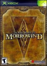
 Elder Scrolls III : Morrowind
 Overall: I don't mean to sit on the fence
 over this title, but in reality it just
felt like it started off with a bit of
mystery, anxiety of what was next
in the game. Starting off detatched
from a past and having to fend for
yourself was attractive. But after a
while this game just falls into a
bad RPG pattern.
After you get yourself established
into a character, you will find that
the quests you do, the things you
accomplish and the attributes you
gain are all but interesting. Along
with that, they make no effect
whatsoever on the world around
you. If you slaughter an entire
town, nothing happens, no one
cares, its not all that important to
them.
Interaction is pathetic. Long
winded answers about absolutely
nothing are the basic reaction you
will get. But more so they are the
SAME answers ALL the time.
This game just lacks fluidity and
emmersion. It feels like you are
playing with 2d characters and the
only way they made it open ended
is by leaving out most of the story,
interest, reaction and intuition that
I would have wanted to see from
this game.
It is good for the first 10 hours.
Once you get into the quests you
tend to get bogged down by
repetition, lack of response and
lack of accomplishment.
NOTHING HAPPENS and
NOTHING is spectacular except
the water effects, which in their
own right have flaws too.
Gameplay: The gameplay in this game is
somewhat stiff. Using a control
scheme similar to Halo, the
character looks with one joystick
and moves with the other.
Trying to pin down the right kind of
swing with your sword is
aggrivating. In order to slash you
have to press to the side while
swinging. When in a fight it feels
more like a square dance since
you keep running forwards and
backwards and side to side trying
to hit your opponent.
Jumping is sluggish. Running
and walking are sluggish. Holding
down both triggers and hitting
buttons is okay if you need a
solution to more keys...but really
dont make the triggers jump and
attack. Hey take a look at your
map! Hang on first friend, I have to
jump and swing my sword before I
can take it out!....
It is possible to get stuck to certain
objects and in certain places,
though that isn't the dev's fault. I
got bored and tried to be a
daredevil instead of playing the
game.
It's not good, but at least it isn't
horrific.
Graphics: I don't care for the graphics in this
game. The only time I found it to
be stunning is when the water
looks clear but also has a slight
reflection. Looks great! Too bad
the water is really slow and
ticky...wait too bad EVERYTHING
is slow and ticky.
No sorry, not everything. When you
are inside buildings it is fine
40+fps, but the brilliant people at
microsoft didnt think to overload
this puppy with RAM to make
things just a little easier on the
processor.
The graphics are fuzzy when
compared to a pc, even with a
GeForce 2 card, with the water
texture as an exception. Other
textures just look terrible. I thought
this console was supposed to be
a powerhouse? Rallisport looks
AMAZING. Halo looks AMAZING.
This game? Looks like slow
moving, really cool water, with
watered down PC graphics.
I know this sounds unfair, but they
kept claiming this was supposed
to look better than most pc's. It
doesn't at all! Just the water, that's
the only good looking texture.
The sky is one of the marks on
this game. On the pc version the
sky was crisp and had depth. I
thought it was one of the best
lookin skies in a game. They put
in on the Xbox and it doesnt look
good.
I know for a fact they could do
better with the graphics card in my
console, and yet they cheesed out
on the sky to let the game run at a
ticky 25 fps. Walk around Balmora,
its stiff and sticky movement (that
sounded dirty) and then go into a
building, all the sudden it's fluid!
Watch the water, its stiff...run
through the water, the wake falls
back like cement or oatmeal.
I'm diappointed in what they did
with this graphics card. It just feels
like this console could have done
everything it should with just a little
more physical memory, and not
the video kind.
Audio: The sound in this game is okay.
Not the greatest soundtrack I've
heard, but not horrible at all to
listen to.
The voice acting, as little as you
get, is well done...the unfortunate
thing with it is that it comes
abruptly. You walk past someone
and BANG they are saying
something to you. Or when you
walk clost to an enemy, all the
sudden they are screaming and
such. That is fine, but what usually
happens is they cycle through 2 or
3 sayings and that's about it.
Could have pumped in way more
emotion with some sound. They
have 9 gigs at their
disposal....RECORD A LITTLE
BIT!
Suggestions: The plan was there, the idea was
there....the story wasn't there and
the interaction was lost after the
first hour or two.
Stick to the idea that if you're going
to make a game that is open
ended and boasting the idea of
adventure and escapism into a
new realm, make sure that realm
notices you and praises you and
makes you feel like an important
part instead of making us play
Sim Nobody.
Overall Score: 5.0 / 10
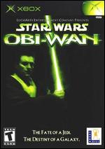
 Star Wars: Obi-Wan
 Overall: This game is terrible. From the chunky graphics to the bugs through out the piece of software, this game hurts more than using a lightsabre for a toothpick. The music is about the only thing that was worth trying this game for. The concept was there, but has been done before as this was to be a sequel. Oh yeah and the floors in the Jedi duel room look nice with the reflections. Who buys a game for the floor though? Terrible through and through it feels like a rushed job and crashed the first time I tried it. Second time I disappeared and was just a floating light sabre...then the level disappeared and then the enemies which killed me because I couldn't tell where they were.
Gameplay: The controls are plain and simple. I know of others who hate the idea that the right joystick is the sabre, but I think it adds to the idea of swinging a weapon. That's about all I liked about the gameplay. The Jedi powers were somewhat of a bore. And why is it that the people with poles and swords could not be disarmed, but guns they could? The ease of flipping and cartwheels was fun to screw around with but really were useless against enemies. Nice try but there was no thought put into this.
Graphics: Ugly. Plain and simple this game looks like it was a playstation game ported to the DC without any bother on trying to make it look at all presentable. The shading on Obi Wan was so bad that when a friend tried it he asked what was wrong with Obi's back. I said well that's just the terrible shading...either that or he has pixelated sweat effects. Poor movement and animations as well, but I think what is the worst part of the visuals is how SLOW the game runs when you enter a large area. Dave Mirra has large areas and it doesnt slow down, why should this? The effects aren't spectacular and the goings on are hardly taxing. Ugly, poorly coded and just embarassing.
Audio: The music was good. It plays a normal track in the background from the soundtrack and when something interesting happens the music picks up. At times it can be distracting and can give away what to expect in the next area. The voice are HORRIBLE. Obi Wan is not Scottish! Ewan McGregor is, but he didn't use the accent in the movie, yet they put it in this game as a Brit/Scotsman. It also sounds like the voice talent was just trying too hard to get Ewans expressions down which sounds like a mockery. Probably the better part of the game, but still not all that great.
Suggestions: Take your time and stop rushing things. Stop and ask yourself, should a franchise game be so detached from the quality level and style? Stop asking us for money when the things you come out with crash and seem like beta copies.
Overall Score: 3.0 / 10

