MEMBER PROFILE FOR FB-Gollum
Average Overall Score Given: 6.50000 / 10
Total Forum Posts: 921
Reviews
Tom Clancy's Splinter Cell: Pandora Tomorrow
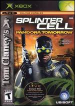
 Overall: An extremely slick package that manages to enhance almost every aspect of the game, and manages to avoid feeling recycled. In all honesty, I liked the first SC. I thought it was cool. It was fun to play when I wasn't playing Halo. SCPT takes it to a whole new level for me. I'm addicted. I need a new mission pack. I need more online maps. It's unhealthy. Really, there isn't much I need to say here, you own an X-box, you know who Sam Fisher is, I won't ruin the rest of the story for you, as it is certainly better than the first.
Now finish reading this then hurry up and go buy/rent a copy already.
Gameplay: I have 2 pet peeves. I'm going to get them out of the way now. 1, sometimes due to the menu style interface, moves don't come off as slick and quick as you would like. It's a handy system 90% of the time, 10% of the time it's irritating. 2, please explain this to me: It's dark enough that I can crouch 2 feet away from you and you can't see me, yet you can still walk around just find "looking" for what made a noise. The AI in the game really needs to make a bit more sense. For example, they should have flashlihgts. It would add an extra element of stealth/evasion as they search for you with the beams. Those that don't have flashlights, should stumble in the dark. I really think a littl eaddition like that would enhance the realism by a great degree. Outside of that, I love everything about how the game plays. The multiplayer is pure genius. A friend and I spent an ungodly amount of time playing it. With comms it is a completely immersive experience. The thing that makes it so fabulous, is that the multiplayer isn't some pared down unrelated off shoot of the real game. It totally captures the tension of the real game, in some ways even more so. It's a heck of a lot harder to work a person than an AI. I can think of plenty of ways to improve it, but who needs to? That's for XboxNext and SC3. The multiplayer as it is beyond anything currently availabe on the market on any system.
Graphics: The best, most functional graphics for any console game currently available. The fact that the graphics in this game are more than just a backdrop or obstacle course is what puts it over. The light maps are so key. In a nutshell, they are as good as any graphics need to be.
Audio: Other than the occasional oddly placed "tension" music, it's all good. I have no complaints, I don't have surround sound, but the sounds are nicley done, all sound very realistic. The environmental sounds and noise are well done (but Ubi always does that well). I have no complaints, or suggestions in this department. It's excellent. If you are unsatisfied with he sound in this game you will never be satisfied.
Suggestions: Nothing for this game, make some more multiplayer maps and some new multiplayer game modes. Release a free mission pack. As for SC3. Change the formula. It will grow old by then. The next game needs to be more free wheeling. Give people a map of the area they will enter, mark off objectives, and their insertion zone, from their, it should be their choice how to go about reaching objectives. Leave more of the map open to exploration. Let people pick a lock and enter a building if they want to. Let them climb the stairs to the roof and jump from building to building. There would be dozens of ways around various issues, discoveries to be made/missed. At the end of each mission give a debriefing and a rating of how well they did as a spy. How often were they detected? Did they kill anyone? How long did it take? What evidence was left behind? How complete was the info they obtained? Partial information could create branching storylines and different missions based on what you've managed to discover thus far. Anyhoo, I'm pipe dreaming right now, but it sure sounds nice. Good on you Ubi for producing a great game. Just be aware you have raised the bar for yourself in future.
Overall Score: 10.0 / 10
 UFC: Tapout 2
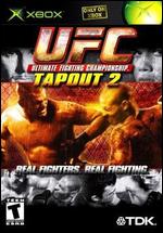
 Overall: What is the point of this game? They repackaged Tapout 1 and threw in a skeleton career mode. There is very little new (the create a fighter screens look like they were ported directly from UFC 1). There is nothing really "new" in this game. It's not that the game is bad, but Tapout 1 played far more smoothly than this. So why would I bother with this?
Gameplay: It would be a lot better of the body parts didn't constantly pass through each other. The hit detection seems off as well. Often a strike that was by scale about a foot off target will impact. In the first one that didn't happen as much. Also, the submissions in part 1 seemed "stiffer". Also, due to rthe fact that you actually get a move set in part 1, it's a hell of a lot less redundant. The problem is, they've basically taken the preset movelists from the different styles in part 1, and gutted them. You use career mode to fill them up. There is very little in the way of actual "customization". You can't create combos, you can't select moves outside of your style. You just fill up the set that you had in part one, and you have a set amount of time to do it, so god forbid you lose a fight. BTW, the only new "position" is the side mount, which look terrible, the animation to enter the side mount is non existent (you knid of just suddenly and extremly quickly trun sideways). Pride FC has a well animated Side mount, and also added the standing clinch (very key and Kind of weird that a game with Muay Thai as a style would lack this fundamental of that art).
Graphics: The skin textures do look great. The muscles flex etc and it's quite good. The movement, well, a lot of the moves look awkward and unbalanced. Even the most basic things. For example, the Shoot Fighters bounce on their heels. No one does that. It looks silly.
Audio: Uh, well, the sound is exactly the same as the first. Same voices to choose from, same grunts, it's really boring.
Suggestions: Here's my 2 cents. If you've played (and you have no idea how it pains me to say this) Pride FC for PS2 then you know what a good MMA game is. You can customize your combos, create everything about your fighter from the ground up. TDK advertised an "in depth" fighter creation system. This is an absolute and utter lie. The create a fighter is EXACTLY THE SAME AS PART ONE (even the screens). I've been a martial artist for over 15 years, if you want to make the greatest martial arts game ever you simply need to do the following:
1. Make sure everything can be customized. This means custom combos, the abiltiy to design your fighter's appearance. They should use a similar format to most wrestling games for this. Variety is key, there should be hundreds of possible outfits. Custom movesets are a must. It allows people to design a strategy for their fighter and limits redundancy (which increases replay value).
2. If the graphics are hurting gameplay, sack the graphics. Yeah the fighters look great; until they move. The body parts passing through eachother has to stop, it completely ruins the realism. When I slap on a leg bar and my opponents foot passes through my shoulder the move just fails to look devastating or painful. Simplify the graphics if the game will play better.
3. A real career mode. The "career" mode in this game is a joke. It's completely unimmersive. In my 15 plus years of martial arts (in which I have studied nearly every art in the game) I have never encountered a fighter named "Stamina Master" or "Life Master". It's stupid. It's redundant. Beating the same boring fighter over and over again with my 1 move to get my stats up so I can hack it in a tournament with said 1 move is pretty boring and unrealistic. The fact that you have a limited time to upgrade your fighter is also completely bogus. You should have a limited number of moves, not limited time to acquire them. How hard would it be to make it so that when you create a fighter (in career mode, they should have an option to just make a fighter for those who just want to fight), you are given a list of schools and a list of tournaments. The tournaments up you physical stats and win you money. The schools you can spend your money to learn new moves from the Instructors. Perhaps they could even add a store where you can buy gear (better outfits, etc). As you get tougher and leran more moves you can enter bigger tournaments until finally you make it to the UFC. Allow players to advance at their own pace. If you want to be adventurous add an "Xbox Live Career". You could compete in tournaments online with a charater specifically designed for that who can only be used online. You take what you win online and upgrade in your own time. It would start a genuine tourney circuit in the live community. Anyways, that's my 2 cents. They put a little makeup on part 1 and sold it to us all over again. Frankly, I'll bet 10 dollars to a doughnut that this game was meant to be awesome and that they went over budget and decided to just toss it out there to try and recoup some cash. If this is what their intent was they need to overhaul their development team cause this is a cruel joke. Please someone release a definitve MMA game for Xbox, I don't want to buy a PS2, but if this is the best it's going to be, I may have to.
Overall Score: 3.0 / 10
 TimeSplitters 2
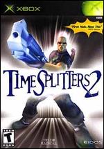
 Overall: 2 words; "Auto Center". WTF? Who's the rocket scientist that made it mandatory? This game could have rocked. The level editor is awesome. Too bad I can't play on any levels, because the game plays so unebelievably poorly.
Gameplay: Auto Center. How the heck are you supposed to aim? It's a nightmare. This alone killed the game. Your reticlce is constantly being dragged towards the center of the screen making following a target or pretty much any type precision shot near impossible.
Graphics: Average graphics. I've been generally disappointed with the graphics on every FPS but Halo. You know they can do better. It doesn't have to be Halo, but at least make it so the screens are clear and targets identifiable.
Audio: Blah. Nothing great, nothing offensively poor. It's likely the best aspect of the game, but that isn't saying ,much.
Suggestions: People are picky about their controls in FPS. Please do not do this again. Take your level editor (which was a grand idea) quickly port it over to another title. Improve the graphics a bit, give people options in their control scheme (like no auto center), and make it mainly a multiplayer game for Xbox live. Add ragdoll death physics and you have a winner. It ain't tough.
Overall Score: 2.0 / 10
 Dungeons & Dragons: Heroes
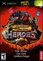
 Overall: A hybrid of Baldurs gate and Gauntlet that in my opinion, largely manages to capture some of the best elements from both. Good level of character customization combined with deeper fighting and a greater variety of foes than Baldurs. It has faster action more reminiscent of Gauntlet. However, the action isn't quite at the frenetic gauntlet pace and stil requires a level of skill greater than gauntlet (just mashing buttons won't do it). There are no creature generators or such, but creatures do reinhabit areas after you leave, unlike Baldurs. The levels come faster and the games pace overall is increased. There is also a greater number of skills and a 2 different character classes. Overall, a great game that is lots of fun multiplayer.
 Gameplay: The game plays more or less exactly like Baldurs gate. Some of the interfaces are a bit different and it includes a couple of just fantastic features. Instead of usinf the d-pad to cycle abilities, you hold your right trigger and can quickly select a new feat and map in to the button you wish. It's not only faster, but it allows you multiple special abilites at your fingertips which creates a much bigger variety in combat tactics then either Gauntlet or Baldurs had to offer. A great feature they added is slow-mo when you are switching up the buttons. Everything goes bullet time when you hold the right trigger. This has many uses and makes switching tactics mid combat a breeze. In essence, if you've played Baldurs you've played this. It's not a bad thing, it's just different enough to be freash, and virtually all of the changes I would consider improvements. The primary difference in feel, is that you seem a bit tougher than in Baldurs, and the enemies are a bit weaker, but there are more of them. It seems like a litle thing, but it makes a big difference in the game. The thing I don't like, is that the story has very little depth compared to Baldurs. No conversation trees or the like. You meet people and they tell you what to do. That's about it. It does take some of the immersion away from it. That's too bad, because I'd be absolutely floored by the game if it possesed that. But hey, Baldurs 2 is just around the corner. All in all, some may argue that this game doesn't have enough of either Baldurs or Gauntlet, but I think they have managed to strike a very enjoyable balance between the two.
Graphics: This I would call the games downfall. The camera is too far away and doesn't adjust relative to how many players are on screen. It's perpetually zoomed out to the maximum degree and that can make it hard to see. It doesn't detract greatly, but it certainly could be better. If they had an option to set a maximum zoom that would be amazing. Other than that the camera swing's nicely and the levels look straight out of Baldurs Gate minus one coat of polish. Essentially, it's just inferior lighting to Baldurs. The character models aren't as detailed, which is really a shame considering you zoom in quite close. When you get close you see that the models run awkwardly (like they're bowlegged) and aren't particualarly detailed. That's said, they aren't ugly. They look pretty good and you aren't paying that much attention when hacking up legions of baddies. Overall, the levels look pretty good (not Baldur good, but good nonetheless) and the characters look ok. I'd give the characters a 3 and the levels a 3.5). The cut-scenes on the other hand, look pretty sharp. They are well produced and pretty. I'd give them a 4. Hence, overall it gets a 3.5.
Audio: I don't know how to rate sound. Are the sounds good? Yeah. Can I rememebr the theme song? No. It's not like the Halo theme which I can hum in my sleep. I guess the sound is average, but I don't feel like ripping on this game because of it. The voice acting is good and the sound effects are adequate. They could have been better, but they are effective, and I haven't discovered anything "annoying" yet.
Suggestions: Well, I think the developer achieved what they were after. I don't believe this game was ever intended ot be a blockbuster, but it's got sleeper hit written on it somewhere. If the game was to be better, they could polish the graphics a bit, maybe add a touch dialogue (not much, stay focused on the action). Some more intense sounds would be nice. That would turn this game from a sleeper hit into a multiplayer favourite. Maybe even some Multiplayer vs. modes. I think the combat engine and character customization go far enough to allow for that. Like I said, I don't think Atari or whoever paid for this felt it was a big enough title to put in all the work to polish to it's maximum potential. So it's hard to tell them what to improve,as they succeded in making a pretty addictive action based game for less. Besides, why bother when Baldurs 2 is out so soon. That's not a franchise that's going to be outdone.
Overall Score: 8.0 / 10
 WWE Raw 2
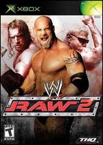
 Overall: First off I'm going to state that the 4.5 overall rating is directed towards wrestling fans. Casual gamers renting for fun may find it less appealing. For them I'd drop it to 3.5. But, back to the review for those who care. The game is a massive improvement over the original Raw. All of the necesarry game modes have been inlcuded, the graphics are much better and the control is vastly improved. The Create a Superstar option has been fleshed out with more and better moves added. There is a also greater control in the appearance than in the first Raw. In almost, actually, forget almost, in absolutely every way this game is utterly superior and a blessing to true wrestling fans who have been waiting for a good app for Xbox. It's about !&%$@#* time. There are 2 horrific flaws I must mention though. First, the interface is garbage. The menus are awkward and obivously unpolished. (Visible menus can't be accessed, just too many steps to creating things like colors etc.). Basically, it isn't user friendly. There's a reasonably great amount of control, but it'll take practice to really tap into it. Secondly, whoever wrote the manual for this game needs a new job desperately. The manual is completely useless. Other than telling you what buttons do what, it provodes little insight into the function of the game. For example, when you select a move, there is a small box at the bottom of the screen that shows what physical skill it relates to. (A body Slam will relate to your Grappling skill, a frog splash to your aerial skill, of course, you set your skills). The box displays an icon that represents each skill. Nowhere in the manual does it show you what Icon means what. Is the fist striking or roughhousing? Of course, you can figure it out, but you shouldn't have to. It's just another symptom of the poor treatment THQ has given Xbox owners.
However, once you put in the time to figure the myriad of details the manual doesn't even attempt to explain, the game begins to shine.
Gameplay: Near perfect. The collision issues are gone. No more having moves interuppted constantly (a major issue in the first game, simply doing the grapple motion would disrupt a move at any point in it's excecution, tres frustrating). The game plays very similar to "No Mercy" for N64, minus the "Strong Grapple/ Weak Grapple". For those who aren;t familiar with "No Mercy", this is a wonderful thing. The game's pace is great too, it feels like a wrestling match. It's not too arcade like the SmackDown series, and not too sim-like. One reviewer wanted it faster, to this I would object whole heartedly, it's wreslting, not streetfighter, it's pretty slow actually. The controls are spot on and excecuting moves is a breeze. The reversal's are also well done, they happen frequently enough that you have to be careful, but not so frequently that you're scared to grapple your opponent. Very well balanced. Finishers are easy enough to do, and it takes a bit to get charged up for one. This is a good thing. The manual claims your opponent has to be stunned to do it. This must be a typo (a mistake in that marvelous manual!? no! it can't be!) because I was able to do it on fresh opponents in the Royal Rumble as long I was charged up.
Outside of that, the matchtypes are great. They are all there. Except Elimination chamber and War Games, but who cares. Hell in a cell, TLC and Royal Rumble are always favourites and they are done to a T. Every other match type is there as well. Seriously. All of them.
Creatign your superstar is probably the most invloved thing I've ever had to do. There are moves for every situation. For example, what if I'm on top of a cage? Well, you have a specific move for that. It's insane, but so very cool. In fact, the creation might be a little too overwhelming for casual fans. It literally can take hours. For us hardcore fans though, it's a wet dream. There are so many options I can't even begin to list them. Your wreslters entrance alone can easily take over an hour. Suffice it to say, The titantron says my wrestlers name (which happens to be my real name, imagine my surprise at seeing that), the pyro goes off exactly when I want it too in my song, which happens to be "Judith" by A Perfect Circle. Absolutley every detail is at your control. I get excited just thinking of all the possibilites. You will too.
I haven't gotten that far in the "season mode" yet, but whagt I've played has been a hoot. The other reviews seem to have touched on it well enough.
Graphics: The faces are great. The animaitons are fluid. The graphics could be better, but the graphics could be better in Halo as well, that sure as heck doesn't make them bad!
Audio: Well, there really isn't much to rate. It's a wrestling game. It sounds like wrestling. There are some cool things though. When you create a wrestler, you select whether he's a face or heel (a great addition by the way, that really adds to the persona of your wrestler) and the audience reacts accordingly. The bumps sound fierce, and the extra loud bumps for finishing moves sound even mroe fierce. It's all in order, and though not spectacular, it really has no need to be.
Suggestions: Get a new person to write your manuals and start caring !&%$@#* it! The genius of this game is hidden from non-hardcore gamers by a sloppy interface and an overall unpolished feel to the game outside of the ring. In the ring it's great, outside, well, it's often confusing. Like I said, experienced gamers may find it simple enough to figure out, but put yourself in the shoes of a casual gamer and it can be overwhelming. Games need to be accesible. This one isn't. That fact alone is going to hurt sales from people that rent it and give up because they don't want to put in the time to suss everything out for themselves. Consider it, if they didn't teach you what the road signs meant in driving school, you probably would've had a few wrecks by the time you figured it all out. Trial and error isn't an attractive feature to be stuck with (even if so many choose it).
Overall Score: 9.0 / 10
 Return to Castle Wolfenstein: Tides of War
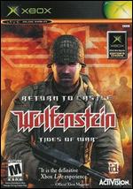
 Overall: Been there done that. This game is rehashed like so many other FPS for Xbox. Nothing particularly new or exciting. The graphics are decent but there's a lack of attention to detail.
Gameplay: Crap physics. The game plays like virtually any other. I simply didn't find the controls very organic at all (compared to something like Halo which feels very fluid). It takes too many shots to kill someone. The multiplayer would rock and I suppose it does on Xbox live, but what do I care? I'VE PLAYED THIS GAME ONLINE WITH MY PC ALREADY FOR YEARS! SELL ME SOMETHING NEW! One player per Xbox system link is a joke. Completly impractical. My friends and I don;t have 12 xboxes at our disposal, we have 5. That should be enough and dev's should realize that.
Graphics: Blah. I don't get why people are so impressed by the graphics. They aren't anything special. Don't get me wrong, they're quite good, but Halo kills it. What is with that stupid kick? They couldn't have animated the character model so when you do your little kick move the character actually throws a kick? I mean, it's these types of little over sights that keep the game from having that immersive feel that superior games do. Physics people. Physics.
Audio: I didn't pay much attention to the sound actually. That tells me 2 things. First, it can't be that bad, I never found myself getting irritated or bothered by it. Secondly, it's not that good. If I'm not noticing it, I'm obviously not feeling it.
Suggestions: God is in the details. Consider that. Also, I wish dev's would really take the time to optimize for xbox. I think this game is getting way more hype than it rightly deserves because FPS fans are hurting for the next "great one". This game is getting praise based on it's timing (nothing else to really compete with it). I hope the devs don't get ahead of themselves and think they actually produced a classic. They produced a good game to pass the time while we wait for Raven Shield/Halo 2/Half-Life 2/Doom III. I guess the bottom line is that with more attention to deatil and some improved physics, this game could have been a classic.
Overall Score: 7.0 / 10

